Simple Clean Website Redesign Project
About the Simple Clean Redesign Project
As part of a user experience design course, I searched for a website in need of a redesign. I found simpleclean.org, a small soap company in southern Illinois. They had pages of happy customer testimonials, but their website was in need of a modern facelift and a functionality redesign. It was a great challenge and experience.
Customer Persona Profile
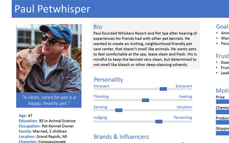
In order to complete an accurate Customer Journey Map and website redesign, I created a customer persona representing a member of the target audience of this website and the products it represents. Using this information aided in the Customer Journey map and facilitated good information to reflectively redesign the site.
(Click the image to see full Customer Persona Profile)
Redesigning the Products Page
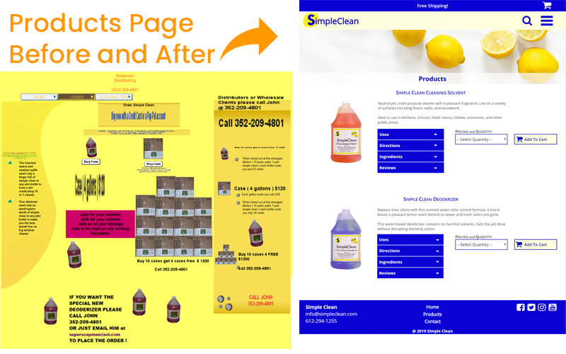
The content on the Products page was distracting, skewed, and contained unreadable text. The huge quantities for concentrate, extreme pricing options, and email or phone to order gave users feelings of distrust and deceit. Creating a functional (and expected) Products page restored credibility to the site and to the business.
Before and After Customer Journey Map
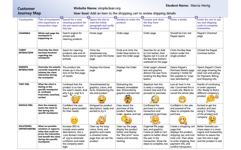
Selecting one user experience defined goal, I created a Customer Journey map illustrating the user experience of purchasing a product using the original website compared to using my created prototype. I conducted usability testing with a random sample of students in the course to get feedback on the experience.
(Click image to see full Customer Journey Map)

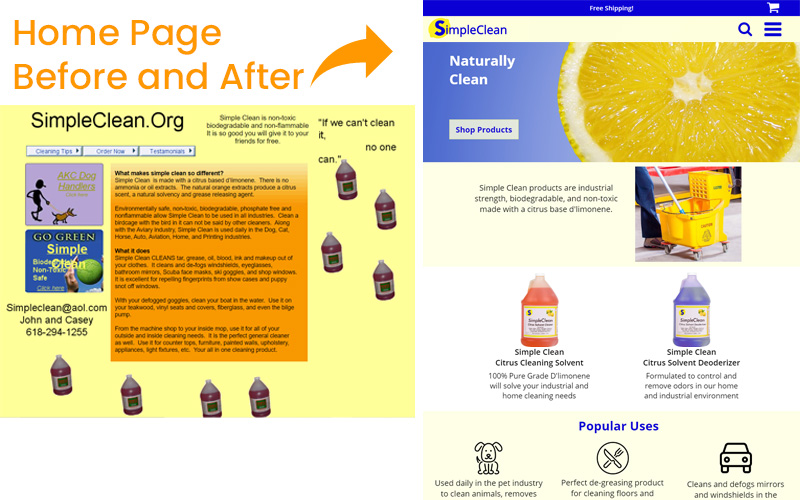
This little soap business is located in the town of Galatia in southern Illinois. The company sells a multi-purpose d-limonene natural cleaning product called Simple Clean. Their website contains distracting elements and bold text on a textured background. It could use a modern face lift and a functioning redesign. The product sounds too good to be true, so maybe with a proper website redesign, I might get a bottle!
Some of the usability issues I defined included:
- The loud color scheme, all bold text, textured background, skewed images, and dancing bottles of soap are distracting and unnecessary.
- The navigation is inconsistent and missing on some pages. The order of the navigation elements is different on pages, too.
- There are several broken links, and the click-able areas are too small.
- The site is outdated and does not function as users expect, giving the site the appearance of not being a real site.
Project Features
- Create and Perform Usability Testing
- Develop a website prototype using Axure RP
- Formal presentation of project and results
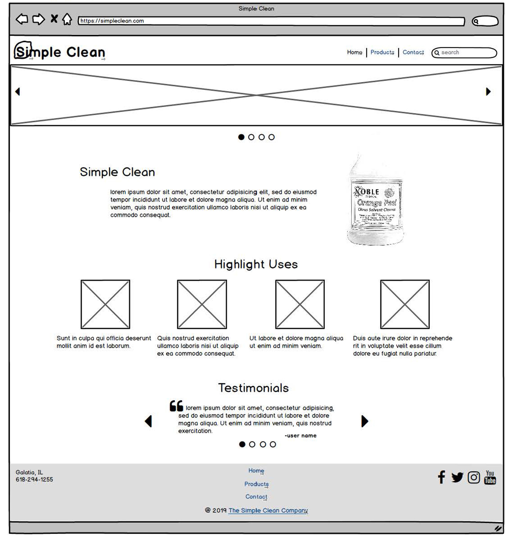
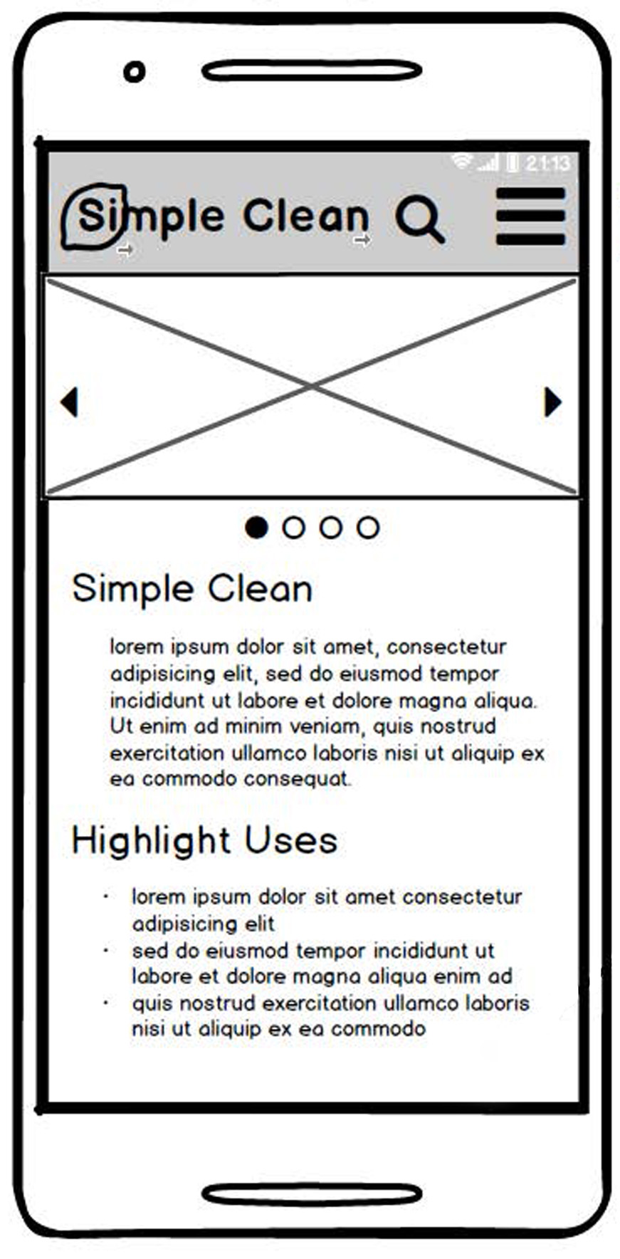
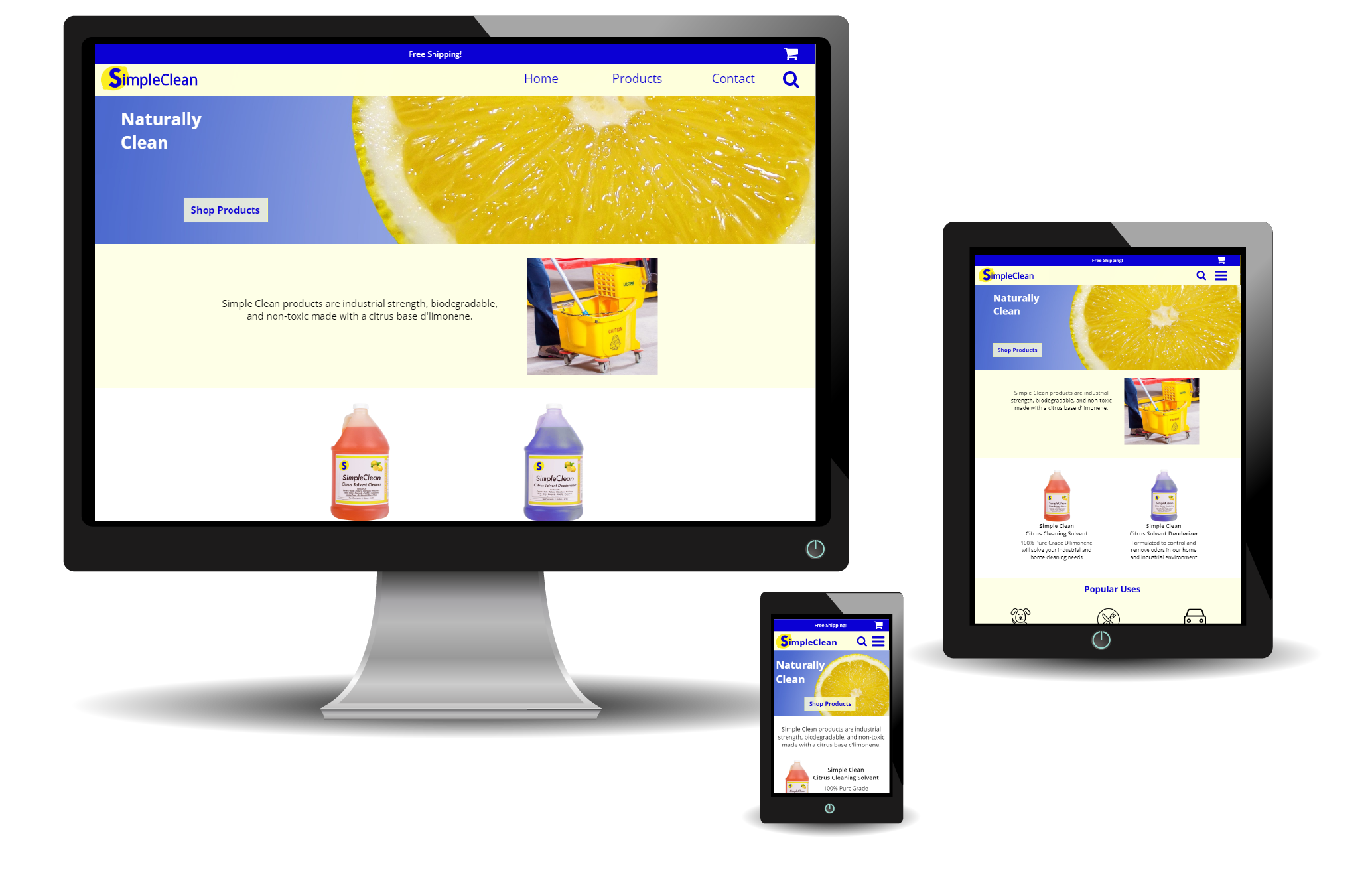
Balsamiq Wireframes of Home Page